Innovative design that creates a warm and reassuring atmosphere: this is the environment that AtelierP realizes for Insparya, the ultimate medical clinic, dedicated to hair care in the heart of Milan, co owned by worldwide famous Cristiano Ronaldo.
Research and innovation, these are the foundations on which INSPARYA rests, the Portuguese clinical medical and scientific group dedicated to HAIR CARE founded by the entrepreneur Paulo Ramos and the footballer Cristiano Ronaldo. A solid base that also inspired the interior design project by ATELIER P which even identifies the best location in Milan city center a firm which boasts over 13 years of experience in the study of alopecia and hair transplantation and can count on 2 million euros per year dedicated to research in the sector.
The location is the Vetra Building in the heart of Milan, a former municipal treasury close to the Basiliche Park in the San Lorenzo district. Strategic is not only the position but also the vision of the architects Luca Piccinno and Mattia Pareschi, called to give this health resort a receptive mood, as if it were a hotel or a residential interior equipped with maximum comfort.
The concept develops in custom-designed upholstered furniture, biophilic design, in the use of materials which, together with a palette of soft nuances, generate a relaxing environment by putting patients at ease.
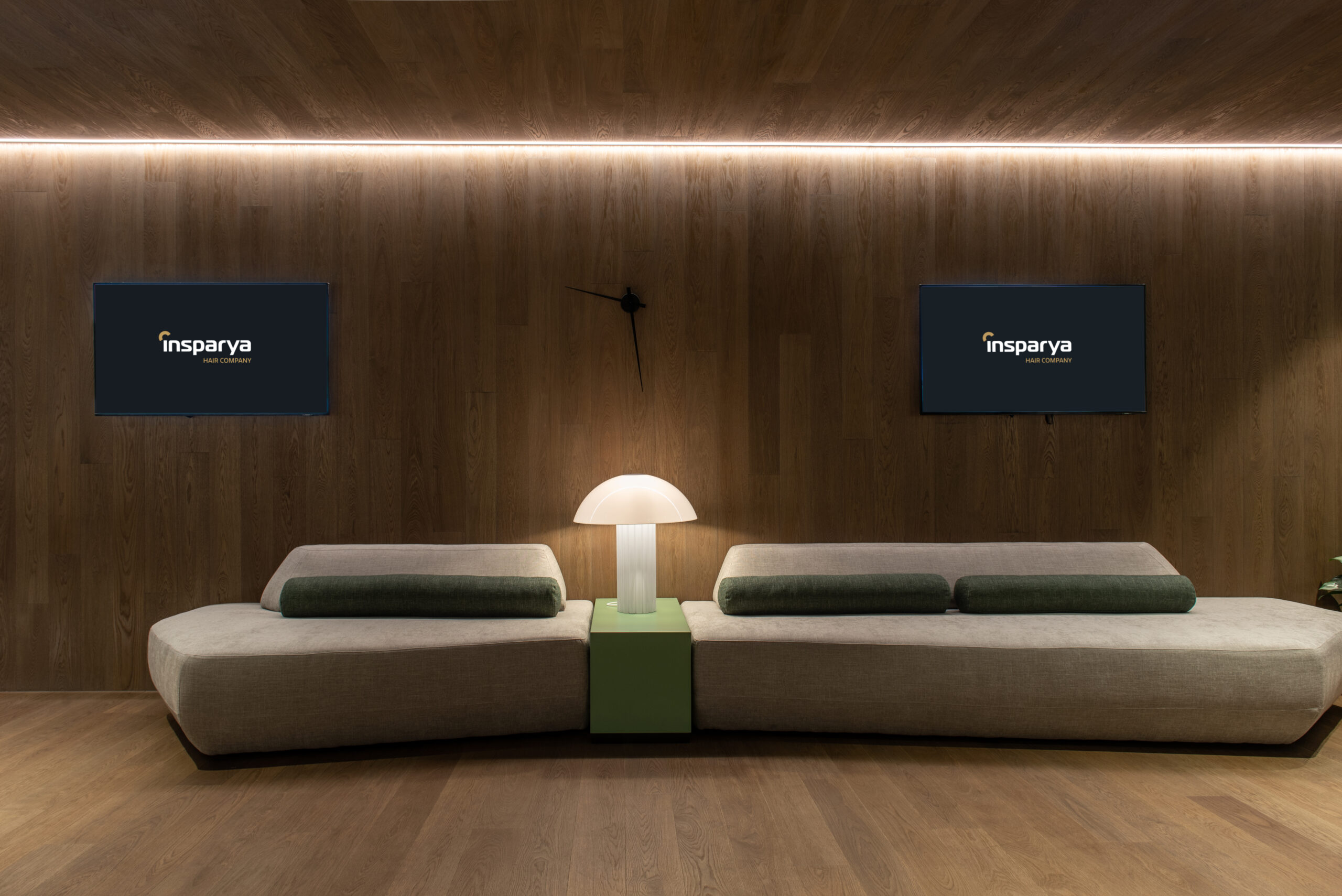
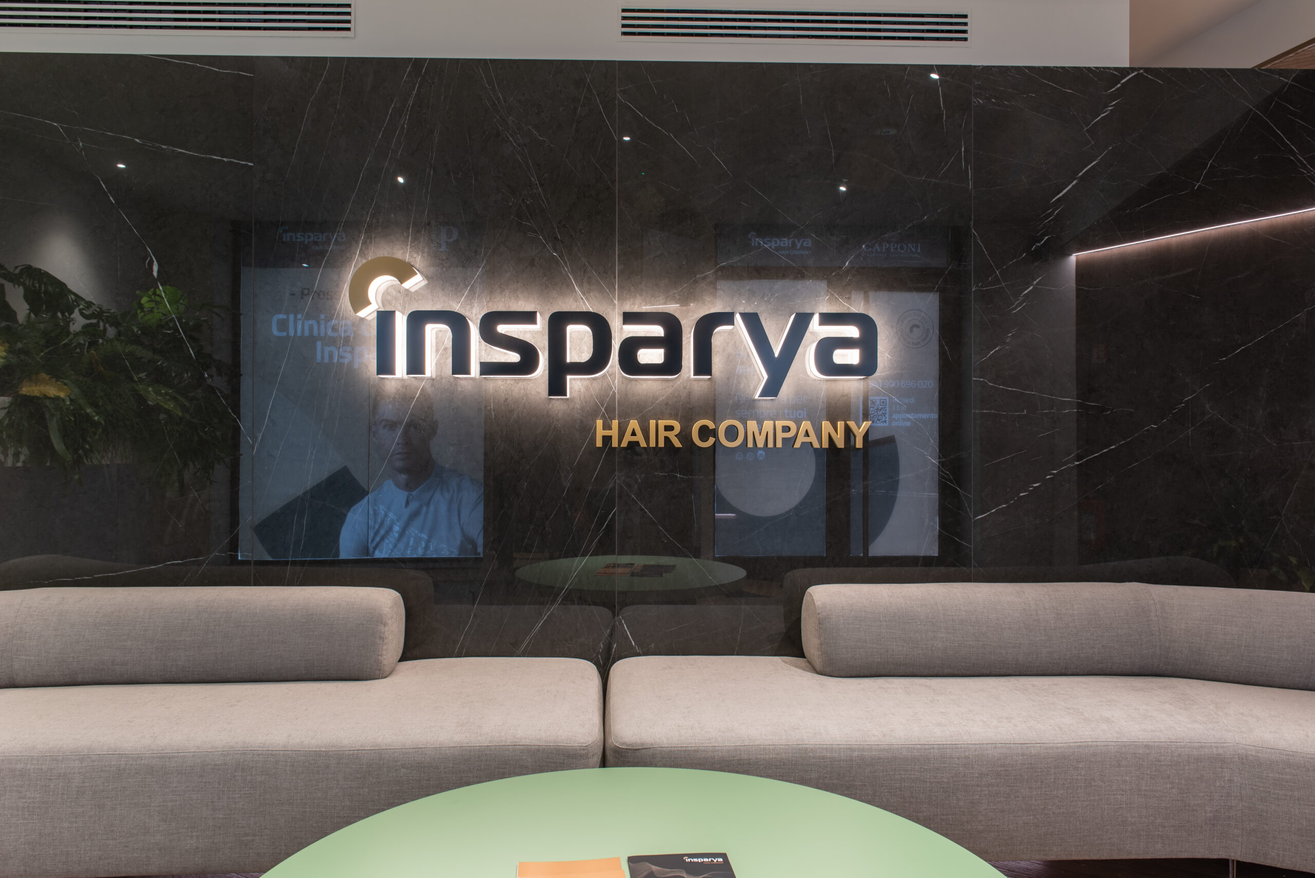
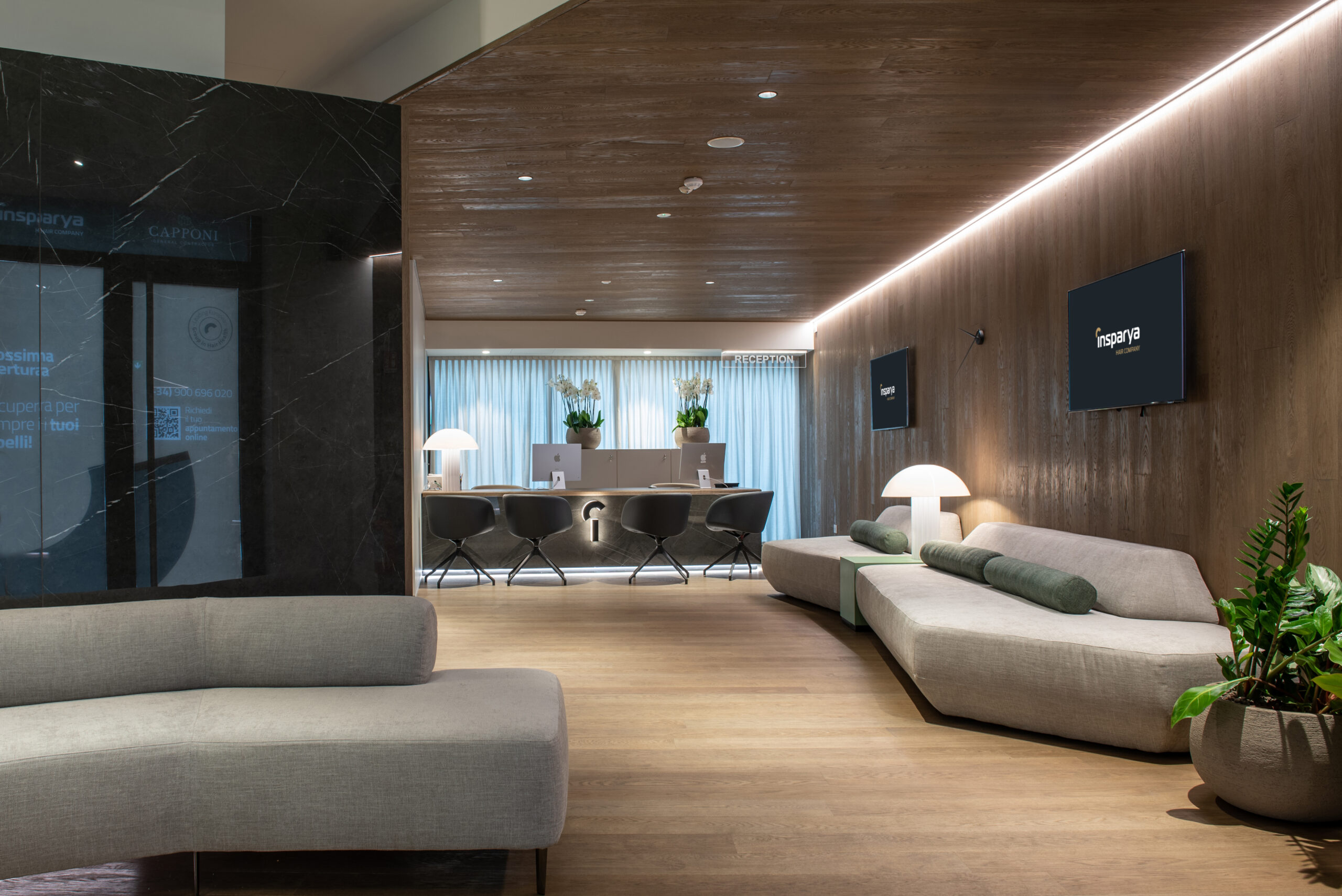
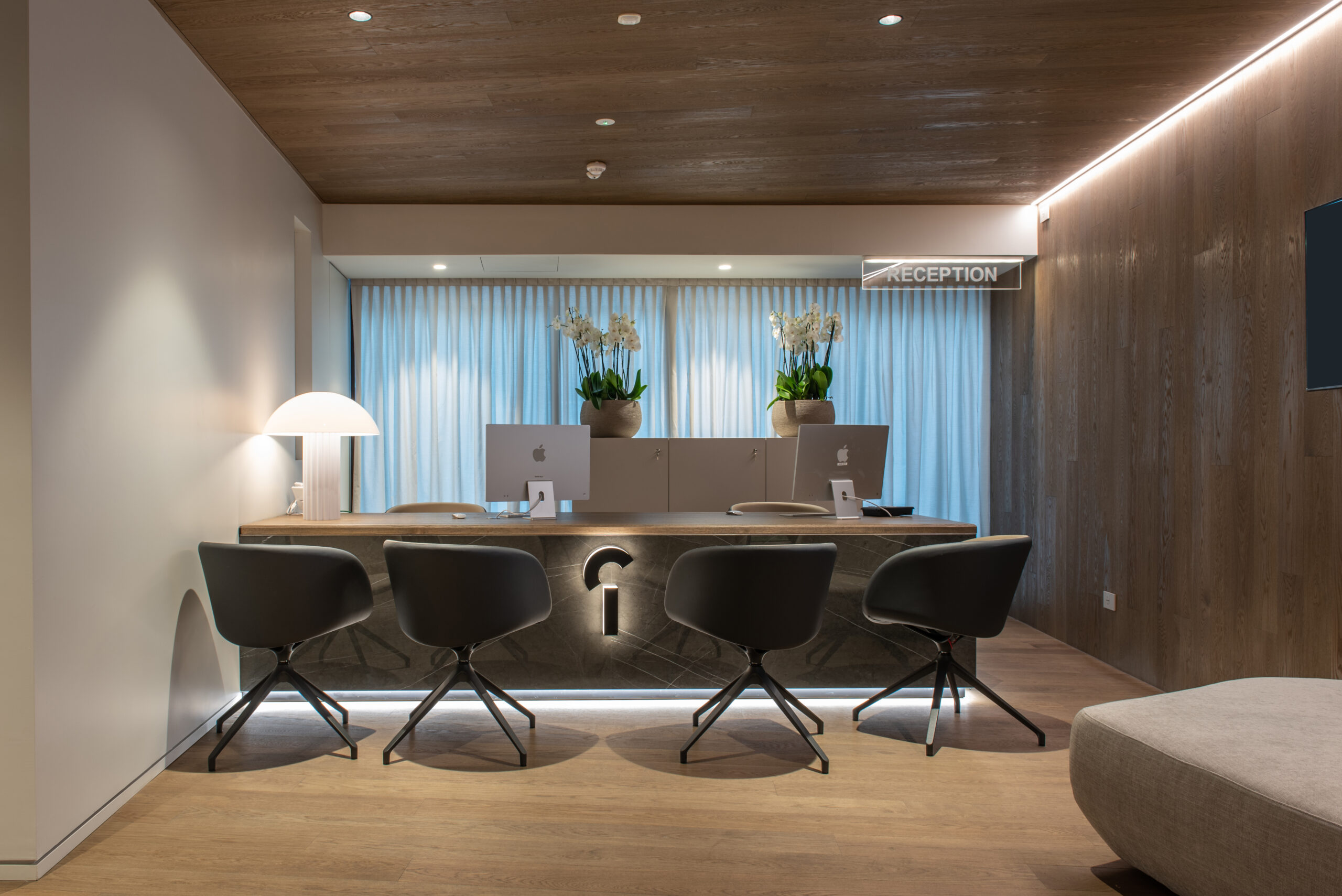
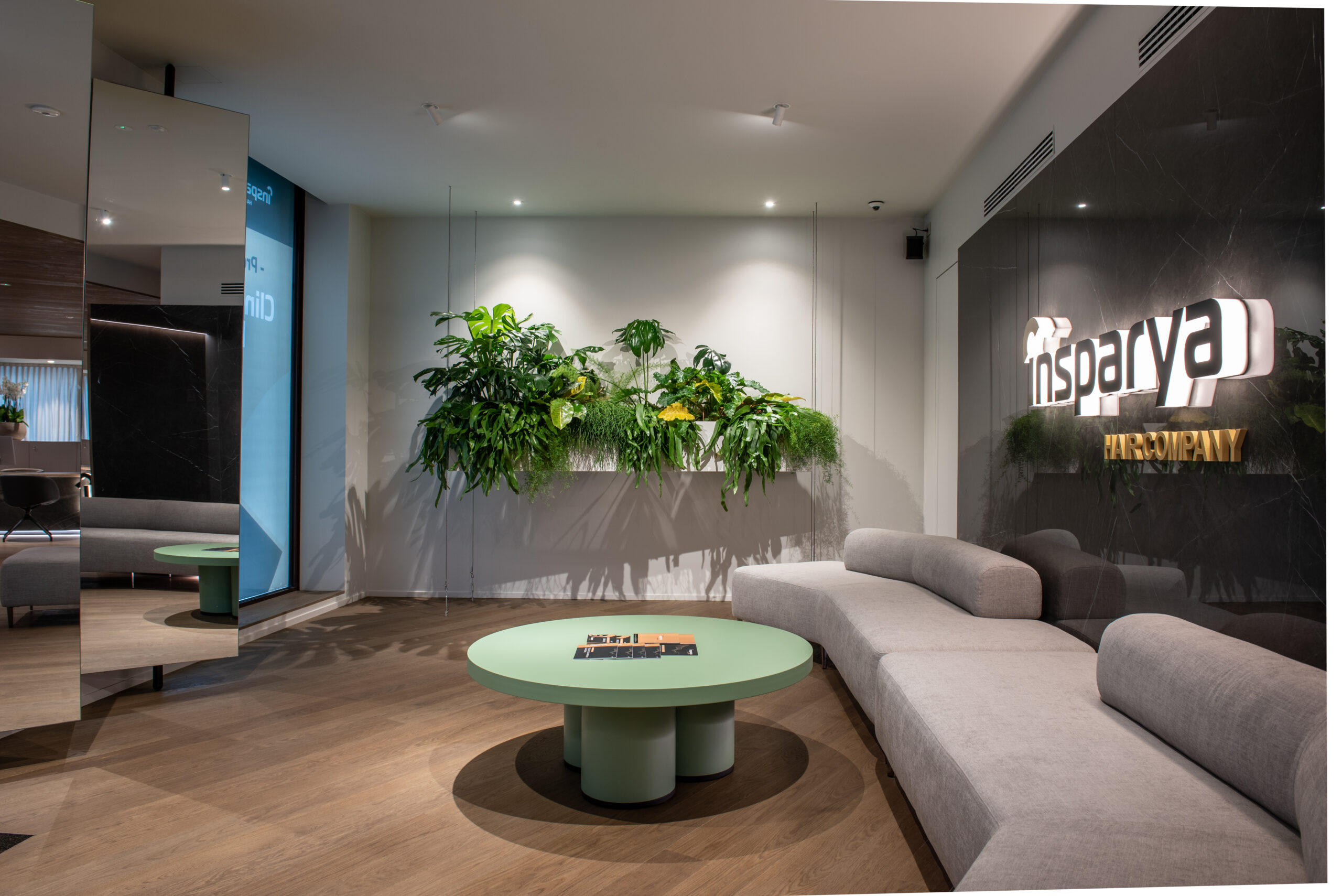
The clinic, 1400 m2 divided in two floors, welcomes on the ground floor (90 m2) with a loungy reception, an area with a single wooden skin on the floor, walls and ceiling which marks the continuity between the spaces in a sophisticated and linear way at the same time. MAFI wood warms and enhances the path which includes two waiting areas: the one near the entrance where the wall covering by ITALGRANITI combines minimalist design with mirrors and an accent of green where a suspended planter becomes the focal point of the room.
The sofas are designed by AtelierP and naturally match with those positioned near the administrative desk. Both architects create a space that inspires well-being. The strength of the brand is reflected in the project, a layout that the firm elaborates by seeking the perfect balance between design, hospitality and sustainability.
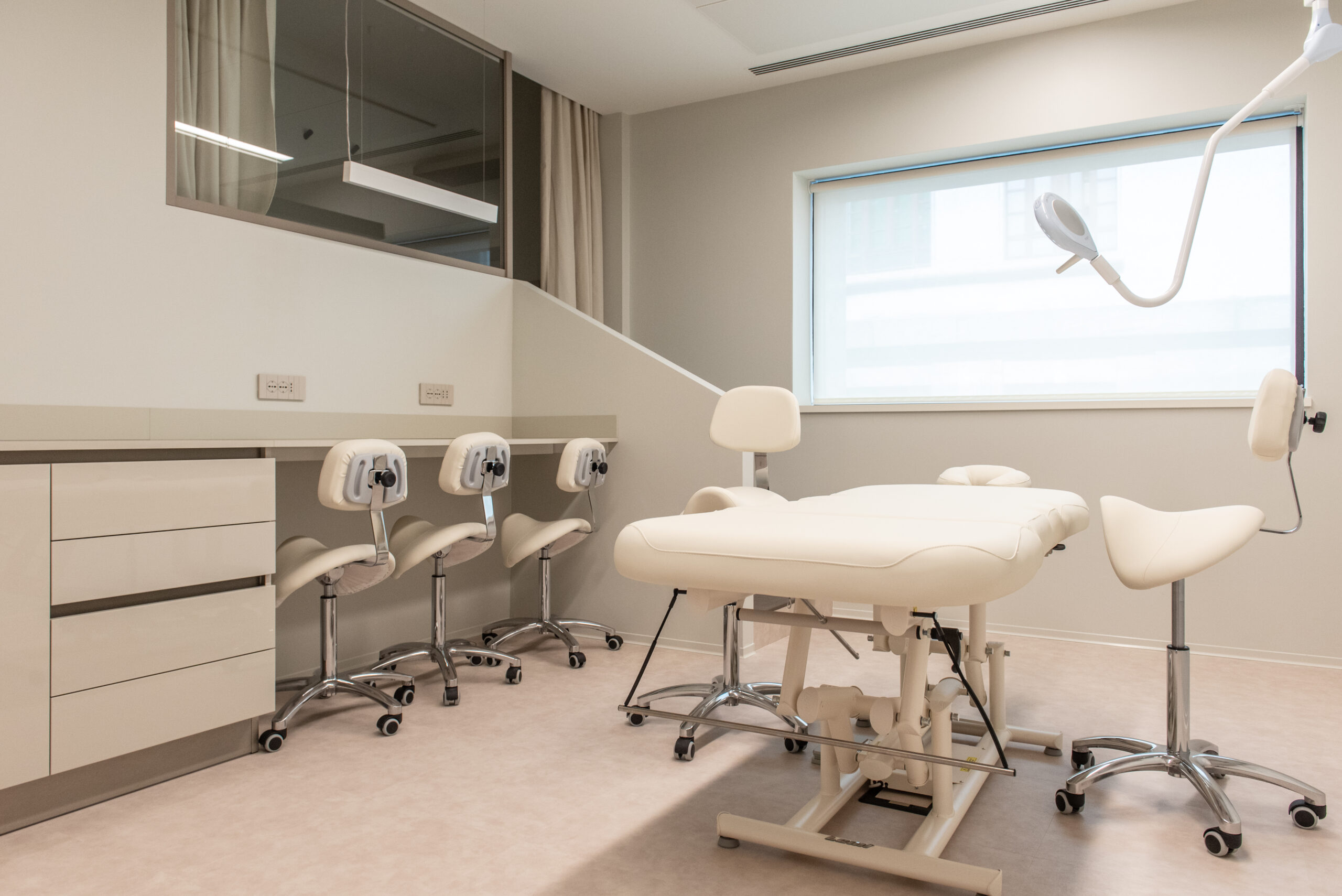
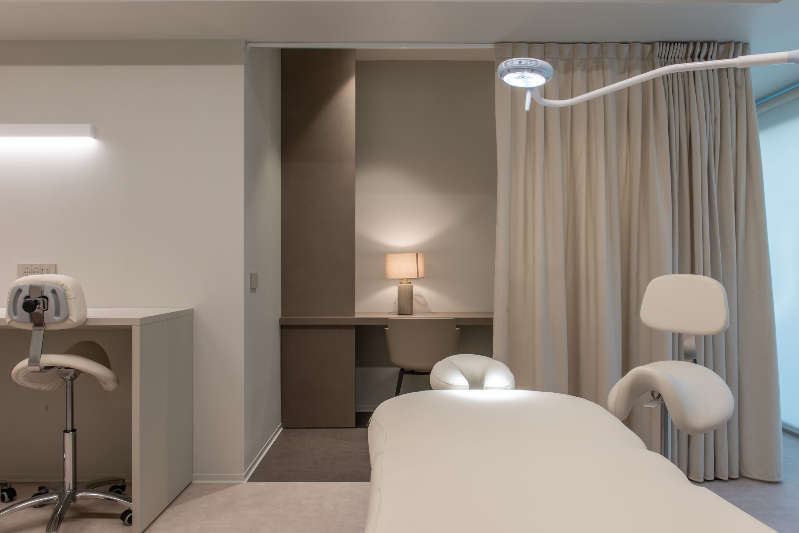
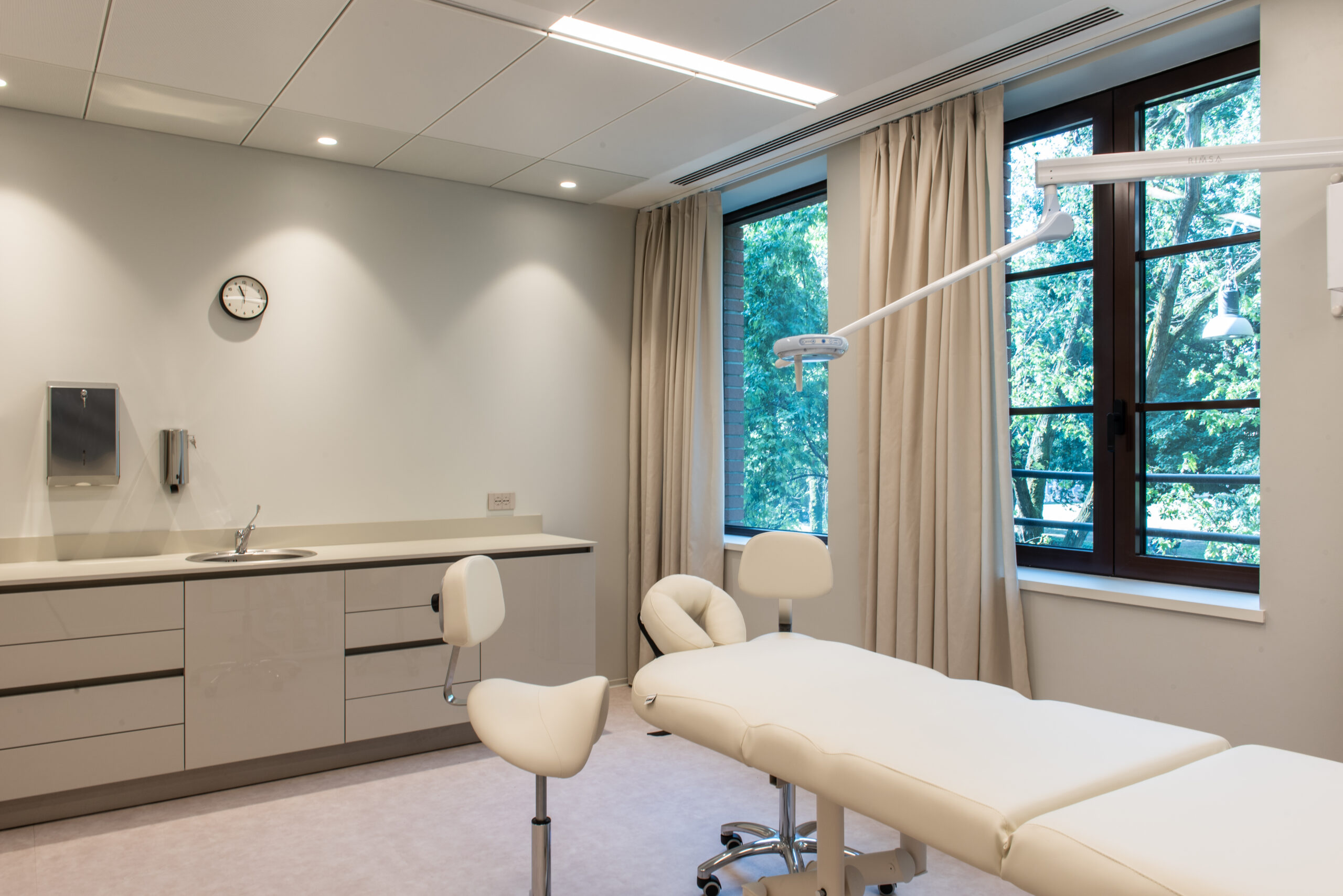
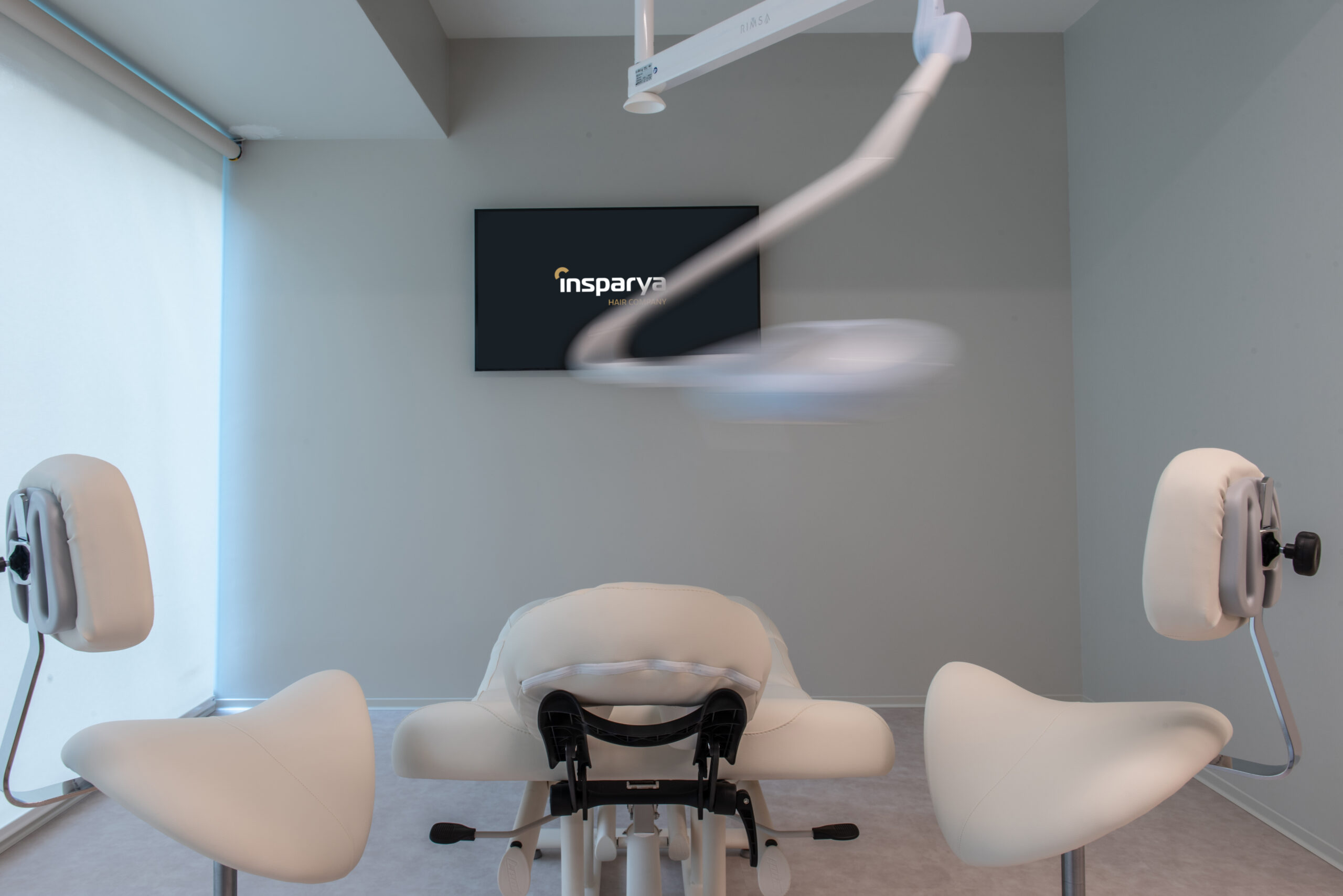
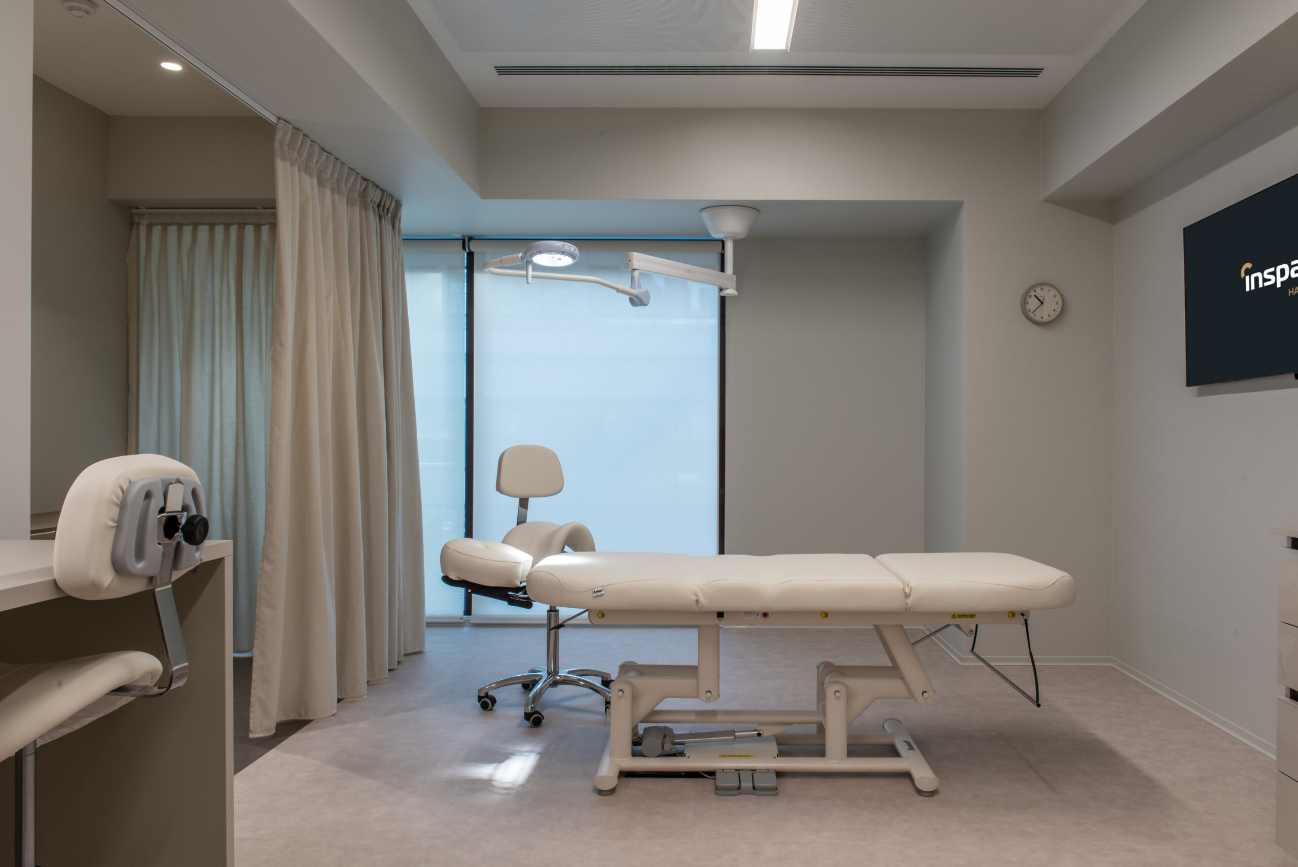
Even the first floor (1300 m2), sees the interruption of the typical continuity of colors and shapes of places dedicated to health care. A funnel-shaped corridor leads into the treatment area of the clinic: here can be found 14 rooms dedicated to FUE technique self-transplants. The two typologies are: 11 ‘superior’ rooms of 25 m2 equipped with private dressing room/relaxation area, and 3 ‘vip’ rooms of 35 m2 for specific treatments, oriented towards the park and with private entrance, bathroom and dressing room.
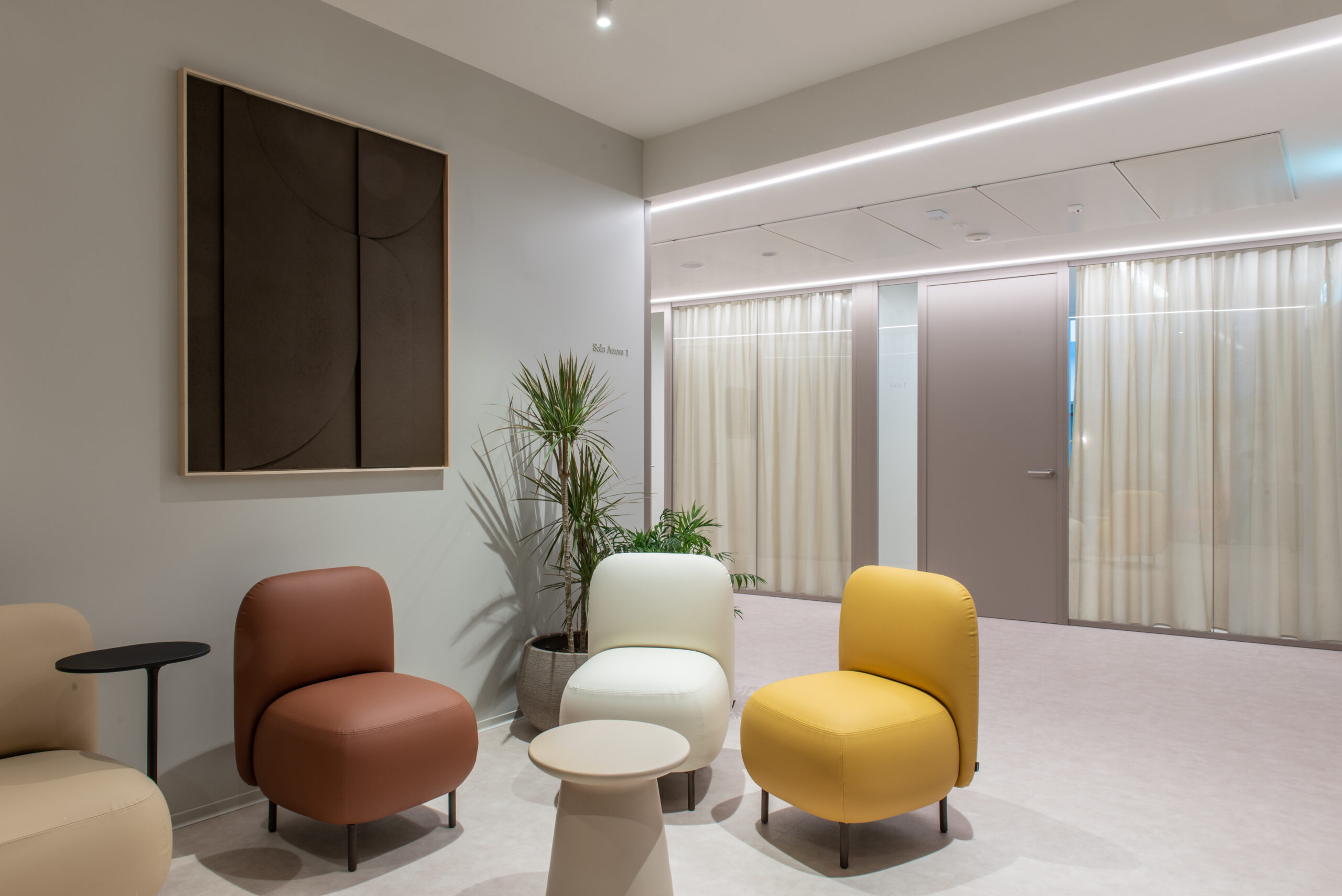
The waiting room precedes the counseling spaces, real sitting rooms while it is included in the pre-treatment rooms. The idea of relaxation runs through the entire project and it is transferred to every area, including the common areas, from the reception to the rest and passage areas, in a dynamic and welcoming flow that represents the heart of the system. Every part of this project revolves around connection on a structural, aesthetic and human level, showing how this paradigm is functional to the growth of a sense of stillness and serenity. They are perceived, for example, in the meeting room, enveloped in the light that descends freely from the skylight, and even in the canteen, whose expressive power is given by the playful combination of colors used for the furniture.
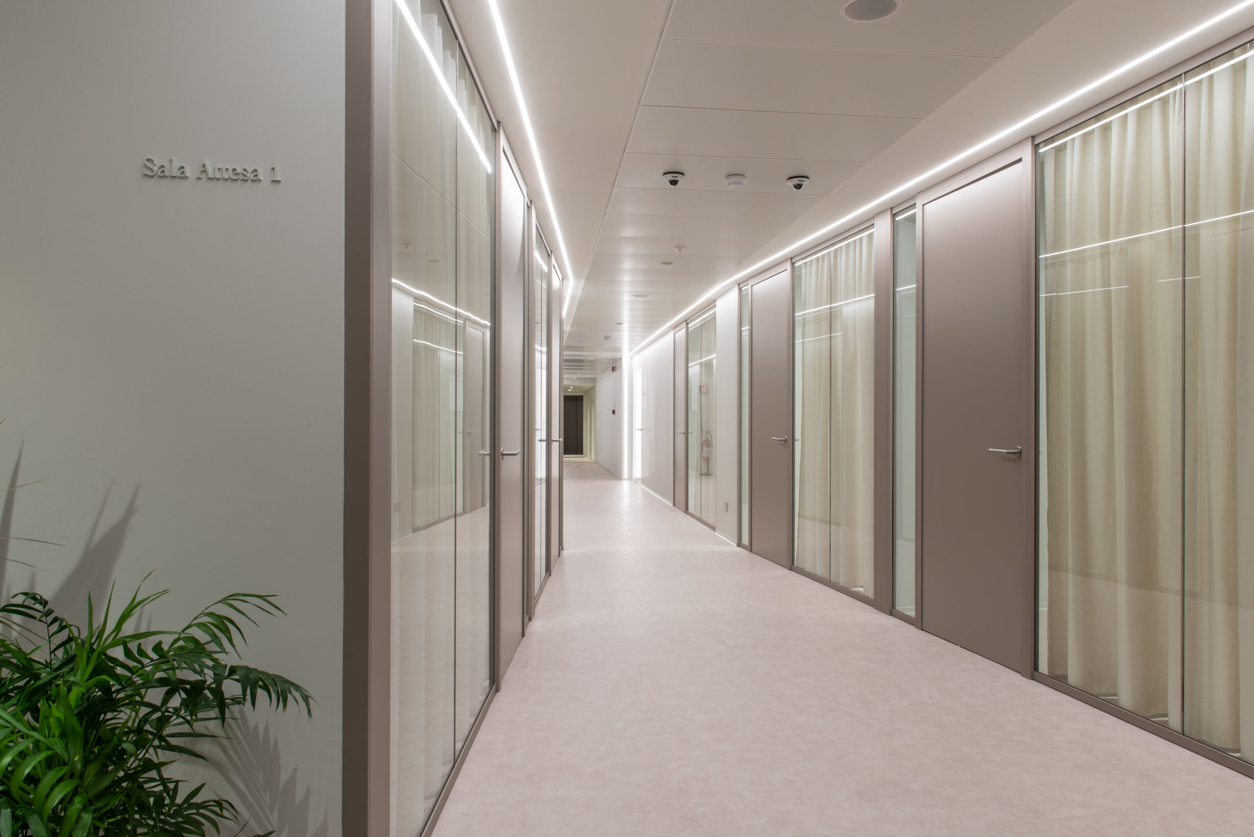
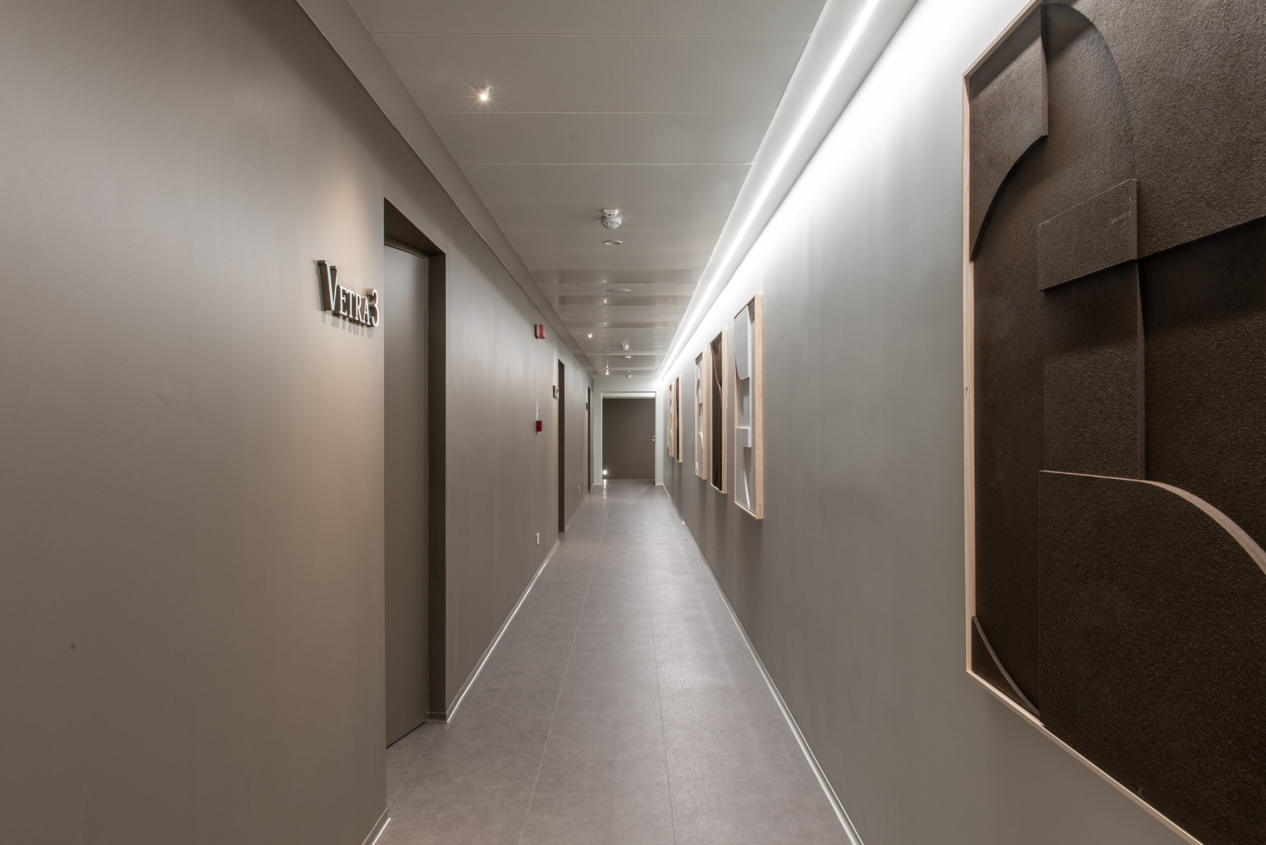
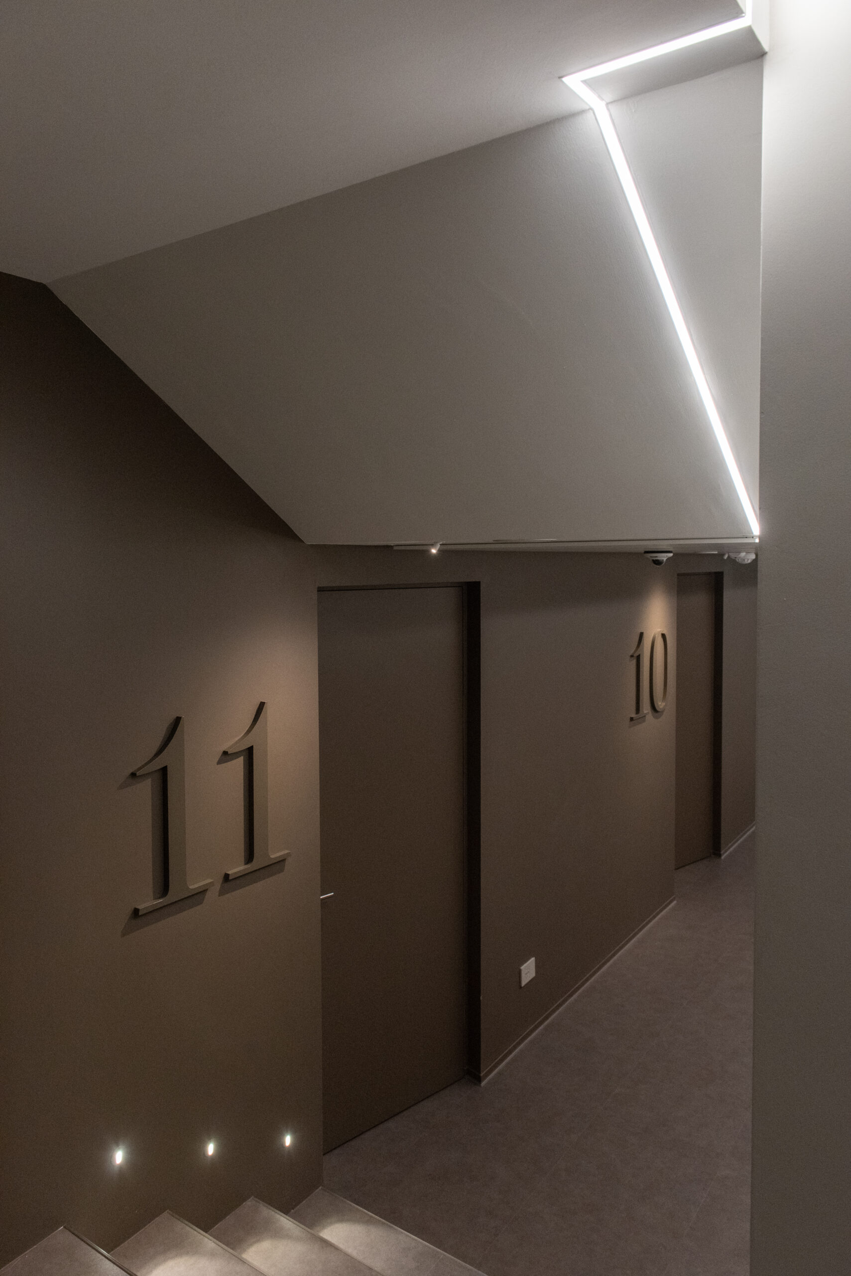
The rooms open inwards and outwards through large windows darkened by curtains in decorative nuances on the corridor side and by technical curtains on the side facing the courtyard. Thus, an architecture of transparencies is obtained which gives rhythm and marks the passage towards the operating rooms, a visual composition which, thanks to the fabrics and the light color palette, lightens the pace of the patients. The shades gradually grow in intensity, finally finding a bold and sophisticated color like taupe. Tone sur tone the numbers mark the rooms in this darker and more stylish part of the corridor which has sloping doors to obtain a niche effect in correspondence with the treatment rooms. The corridor also lends itself as a container for materials thanks to a modular system of built-in wardrobes. Some works of contemporary art shore up the entire length of the space, proposing its geometric motifs and chromatic nuances, even those of the floor made with 60×60 tiles in recycled material that varies in color in relation to the walls.
Each area is flooded with light thanks to double windows and LED lighting technology calibrated to minimum consumption which exploits verticality and guides the eye as if it was a single track.
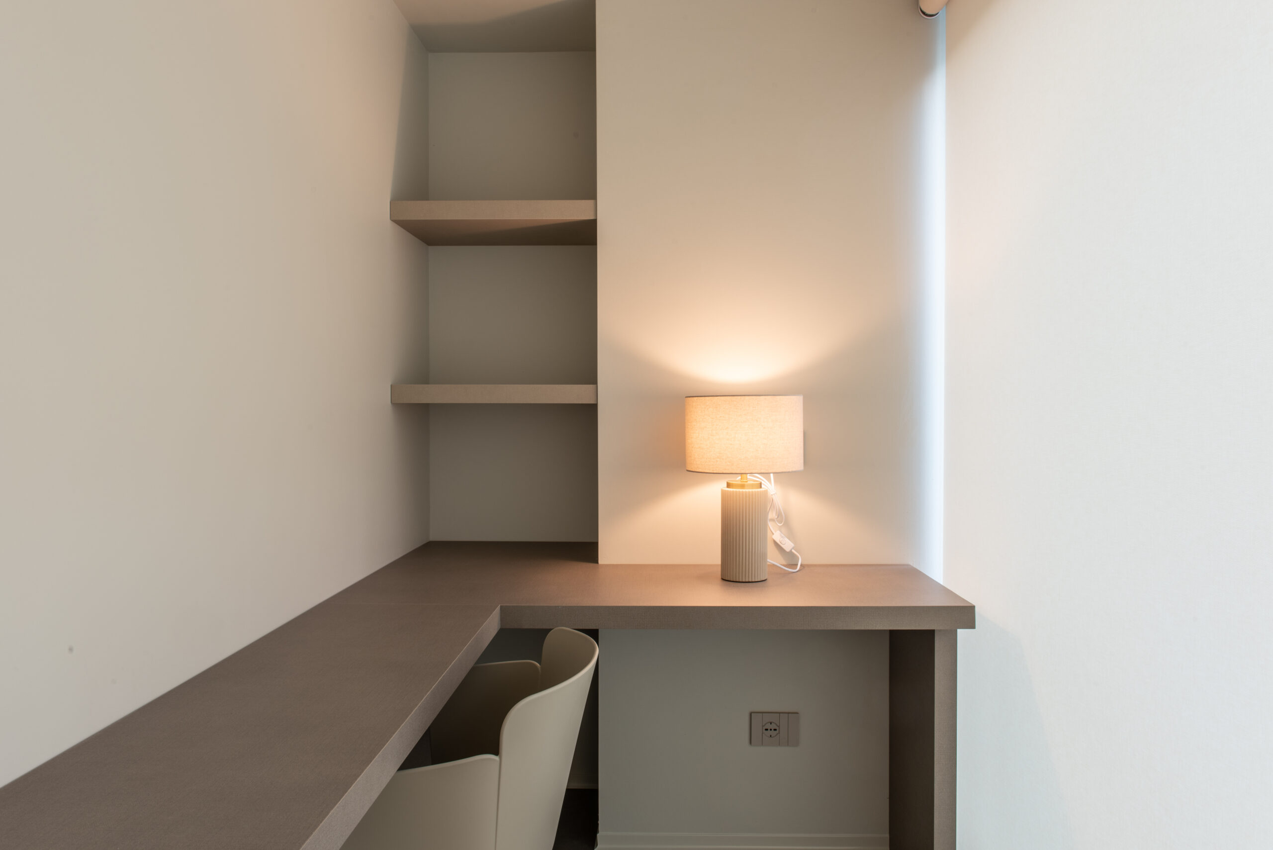
AtelierP also designs all the spaces of the floor, as the kitchens, all by ARREDO3. More generally, each piece of furniture, sofas by PEDRALI like the seats by MIDJ, tables, desks, and walls by MANERBA, is the result of a meticulous choice by the two architects that offer a version of the cold and standardized elements of medical clinics that instead enhances the innovative beauty of the shapes and the softness of the coverings.


